Project Details
Brand Identity
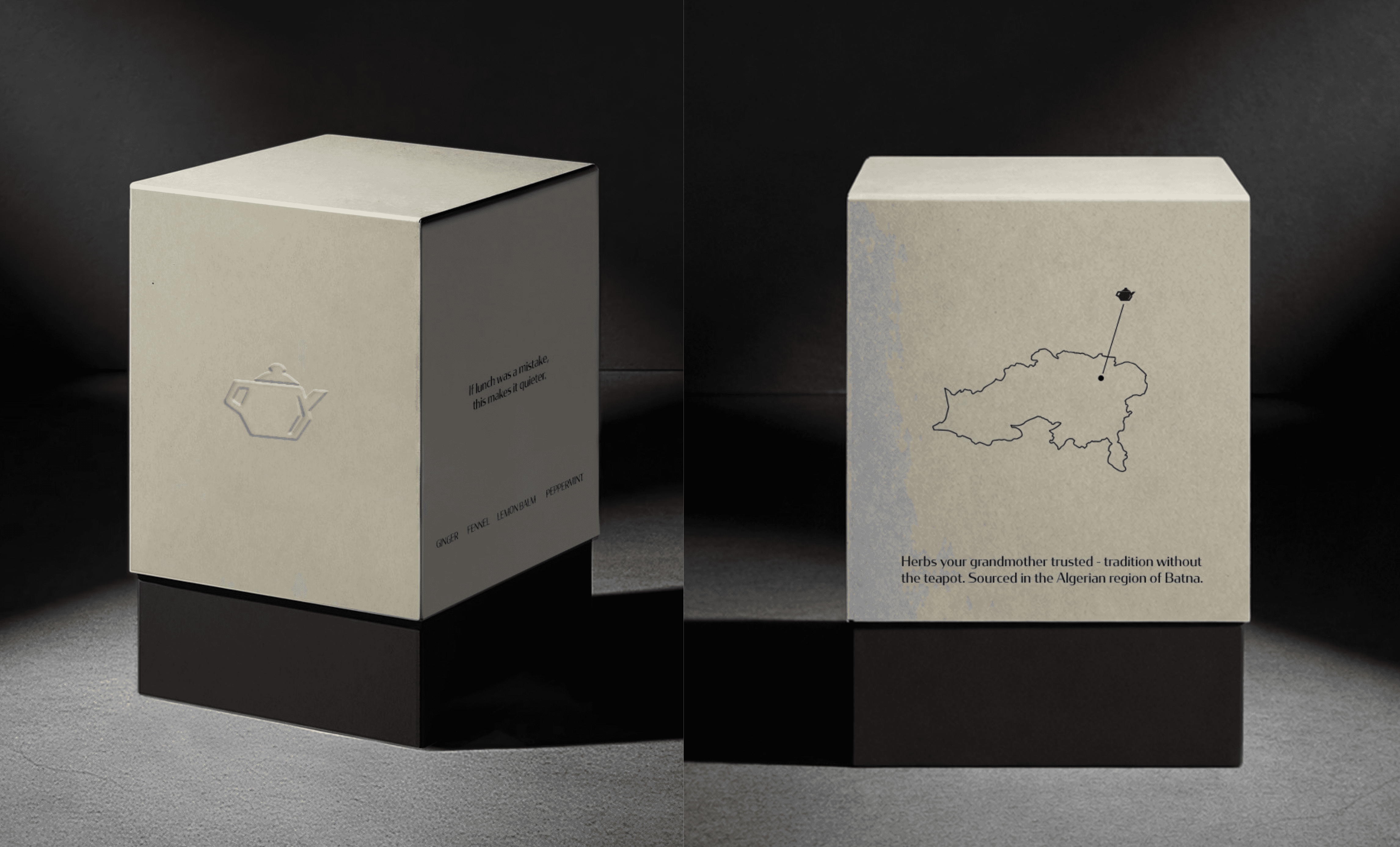
The process began with a moodboard to define the visual direction, which informed the development of the color palette, typography, and logo concept. This created a clear and cohesive brand identity and visual system. The system was then carried into packaging design, translating the brand into a physical product through consistent use of color, typography, and layout.


Packaging
Material contrast defines the experience. Matte, tactile surfaces are paired with smoother finishes to create depth while keeping the design minimal. Each format, from box to pouch to vessel, follows the same logic, creating a unified and recognizable presence.
It is designed to sit naturally within a space, as an object that feels considered, refined, and meant to be kept.